Easy School Registration
Promotion website for WordPress plugin
Team
Freelance
Contribution
Simple market and user research, creating user flows, wireframes, branding and visual design, implementation in WordPress
About
Easy School Registration is a powerful WordPress plugin for managing student registrations to dance courses and lessons. The old website however, didn’t do a good job presenting the best features of the plugin. Also the whole purchase process was manual and required a lot of involvement from founders.
They decided to invest in a new website to boost sales and increase credibility but most importantly – to make the whole purchase process automated.
Process
After the initial workshop with the client, I ran a UX audit of the old website, analysed its usage data, and reviewed the competitors. Then I conducted quick user research – a survey across current customers.
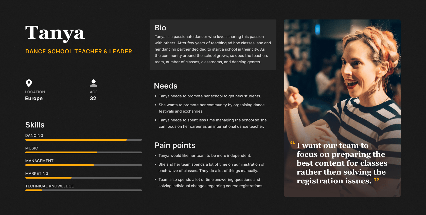
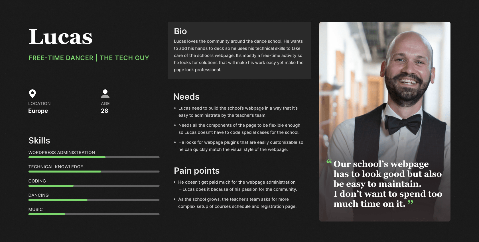
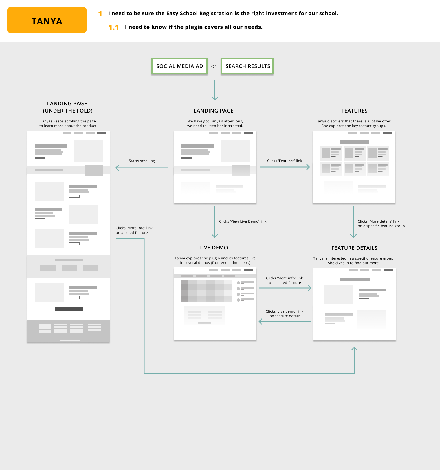
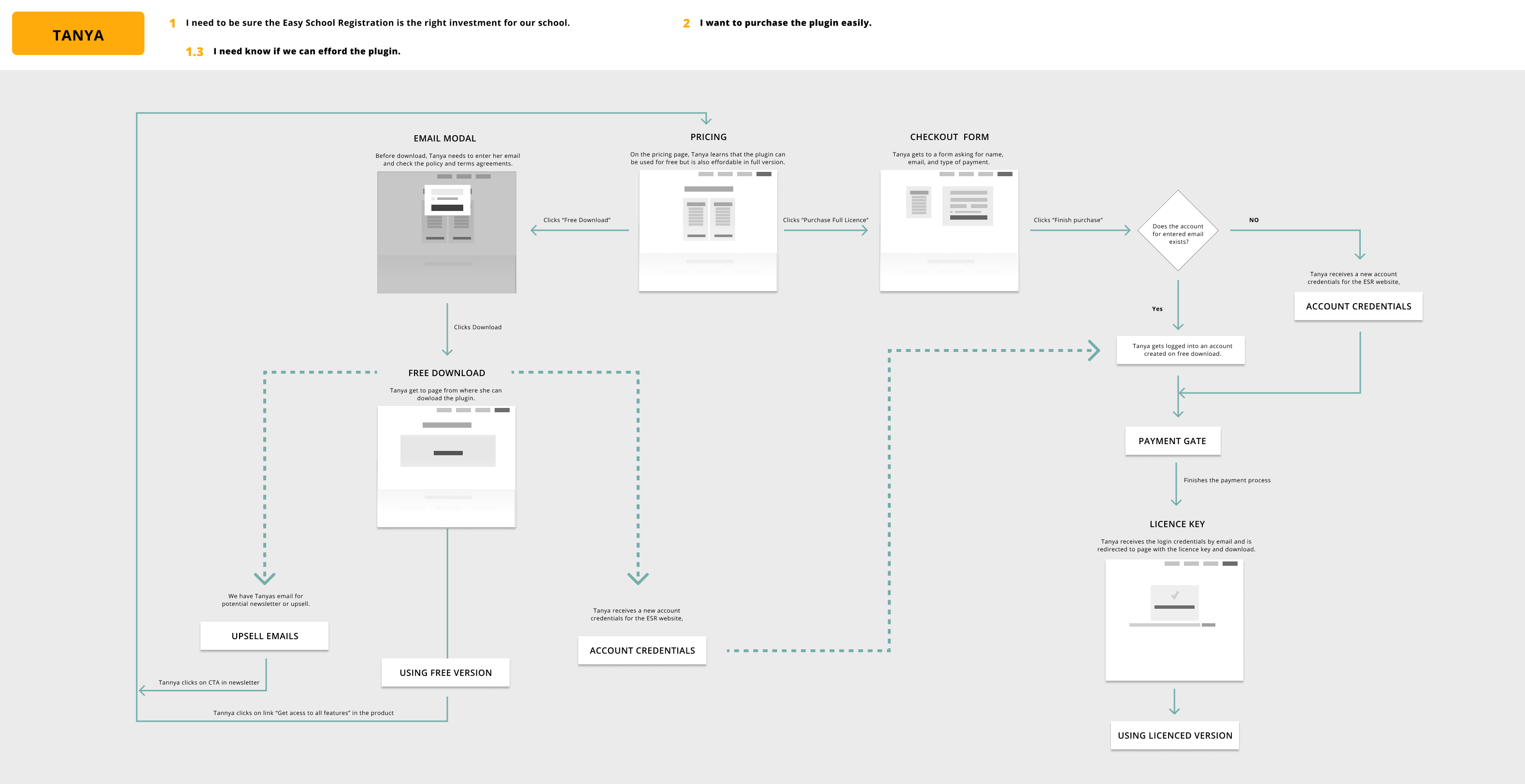
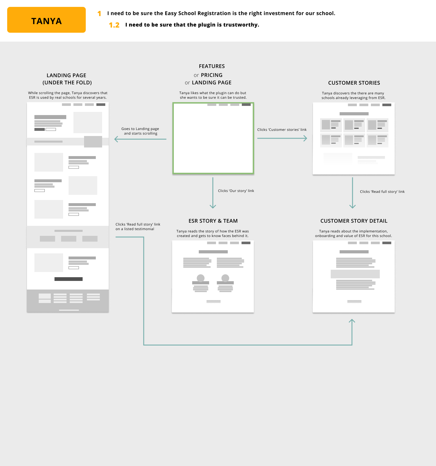
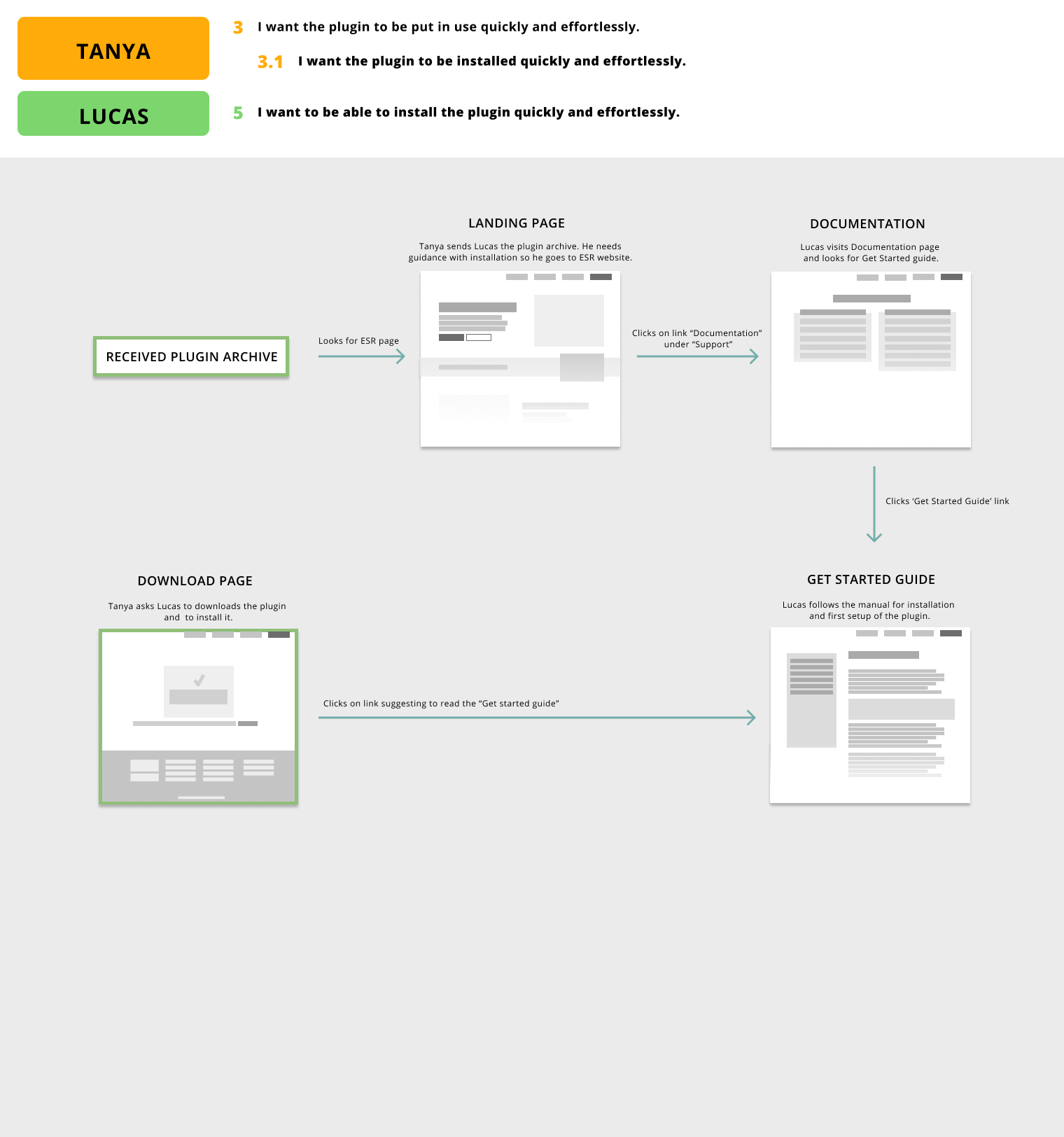
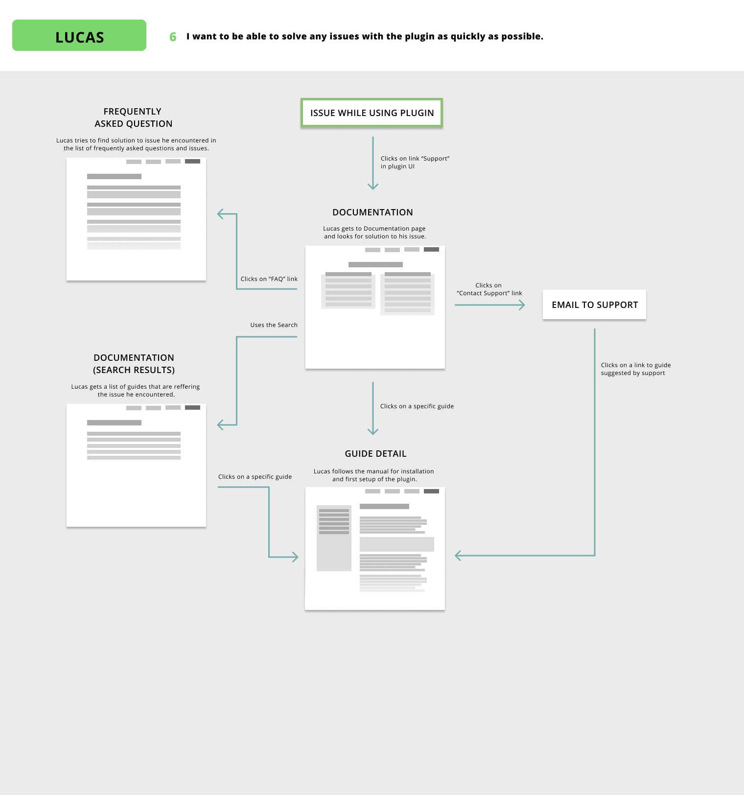
I used my findings to define personas representing the primary audience and their needs regarding the website. These led me to user flows based on which we agreed on the information architecture and the scope of the MVP.
Personas of the main web audience.
High-level flows covering all user goals.
Finally, we have agreed on a whole new visual identity, based on which I created high-fidelity designs including custom illustrations and icons (using free resources).
I built the website in WordPress using the Divi builder. With a lean approach in mind, I was implementing MVP pages simultaneously while still iterating over the wireframes of secondary pages. This proved to be a very good decision as the work was put on hold before the web was fully built. This way at least the MVP pages were able to go live.
Final design
These are designs of the website as of Dec 2020. One of the common aspects of all the dance schools is the energy and joy they bring to its community. Therefore we wanted to create a design that felt playful, fresh and energic but with a strong focus on the main goal – proving to the visitor that this plugin is what their school needs.
Note: I use a lot of illustrations in the designs because the plugin’s UI was planned to be redesigned soon.
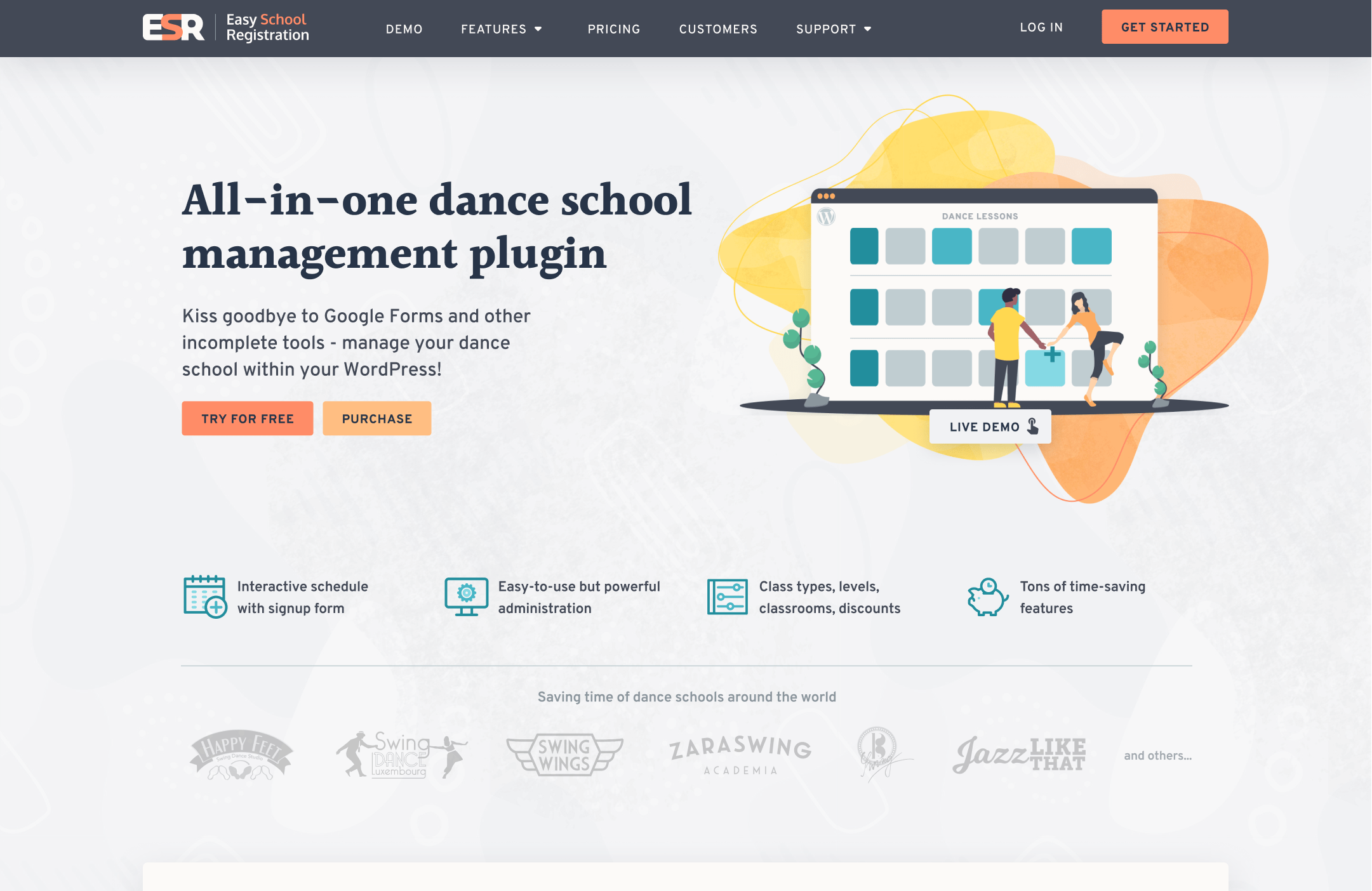
The landing page – usually the visitor’s first contact with the website – focused as a glimpse of the key values of the plugin encouraging the visitor to explore deeper.
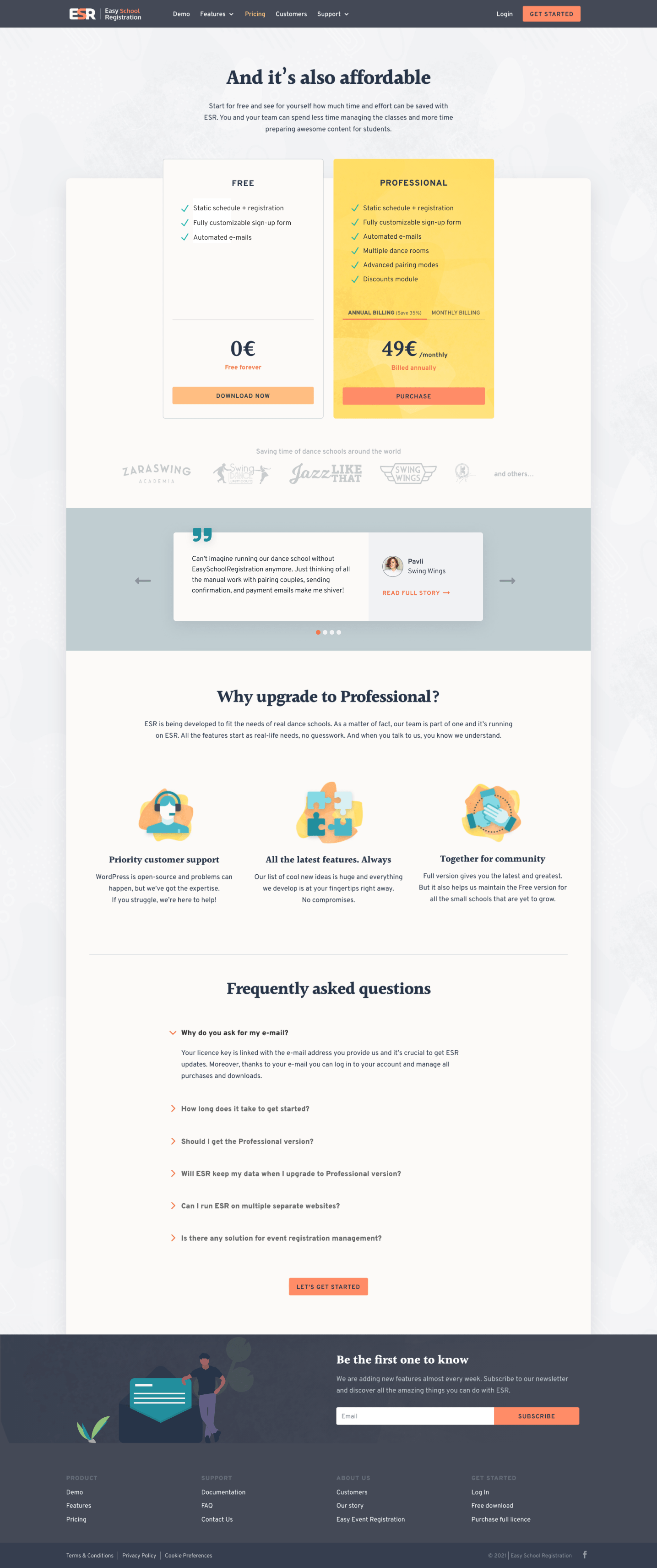
The Pricing page – the main conversion point. Providing Tanya with the option to try the plugin for free or purchase it. If she is still not sure, below the fold, she finds assurance that this is the best move for her school.
The ‘Get Started’ CTA from the navigation leads to this page as well.
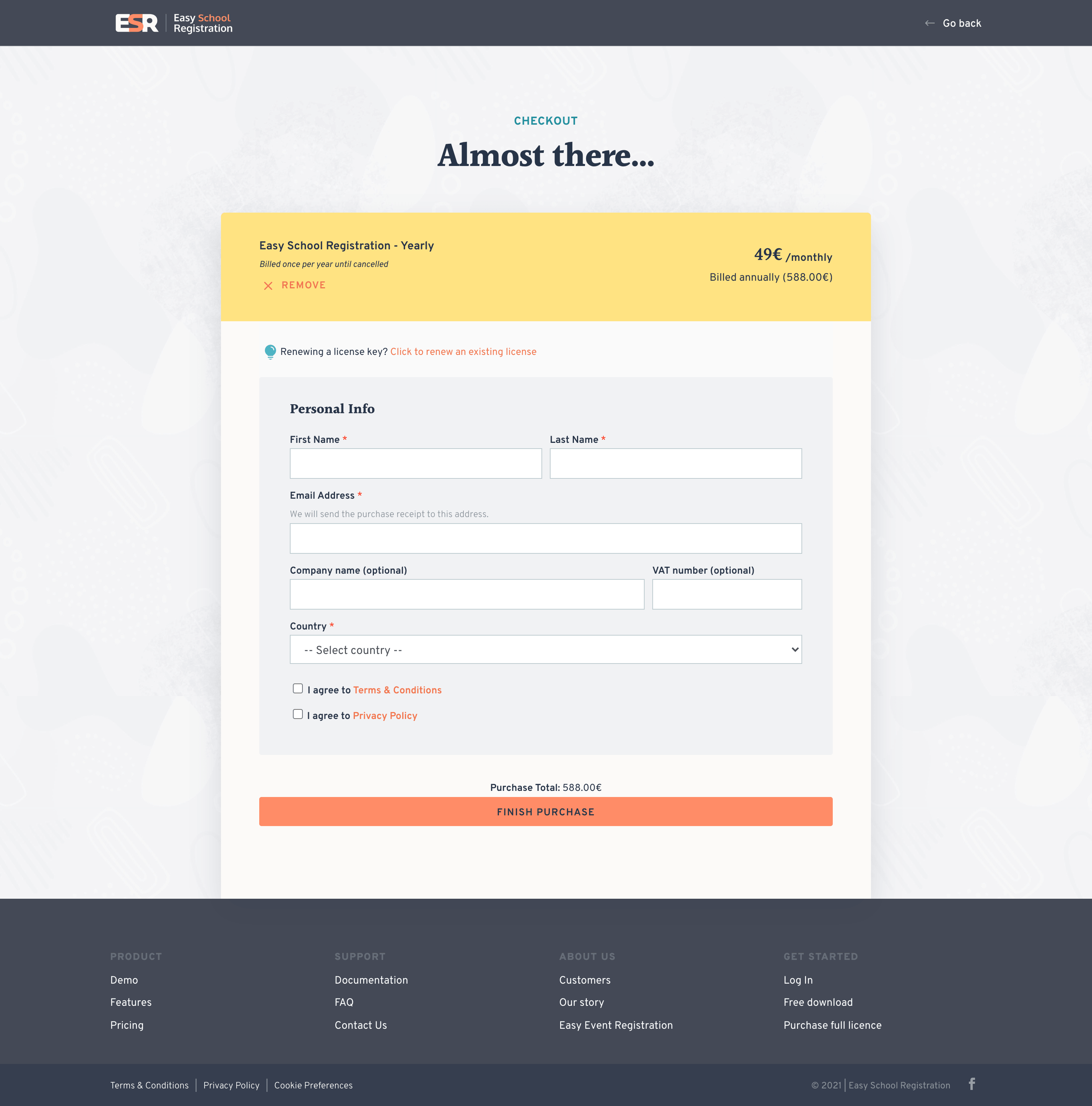
The Checkout page – I did my best to simplify the purchase process as much as possible – no distractions and no unnecessary fields to fill.
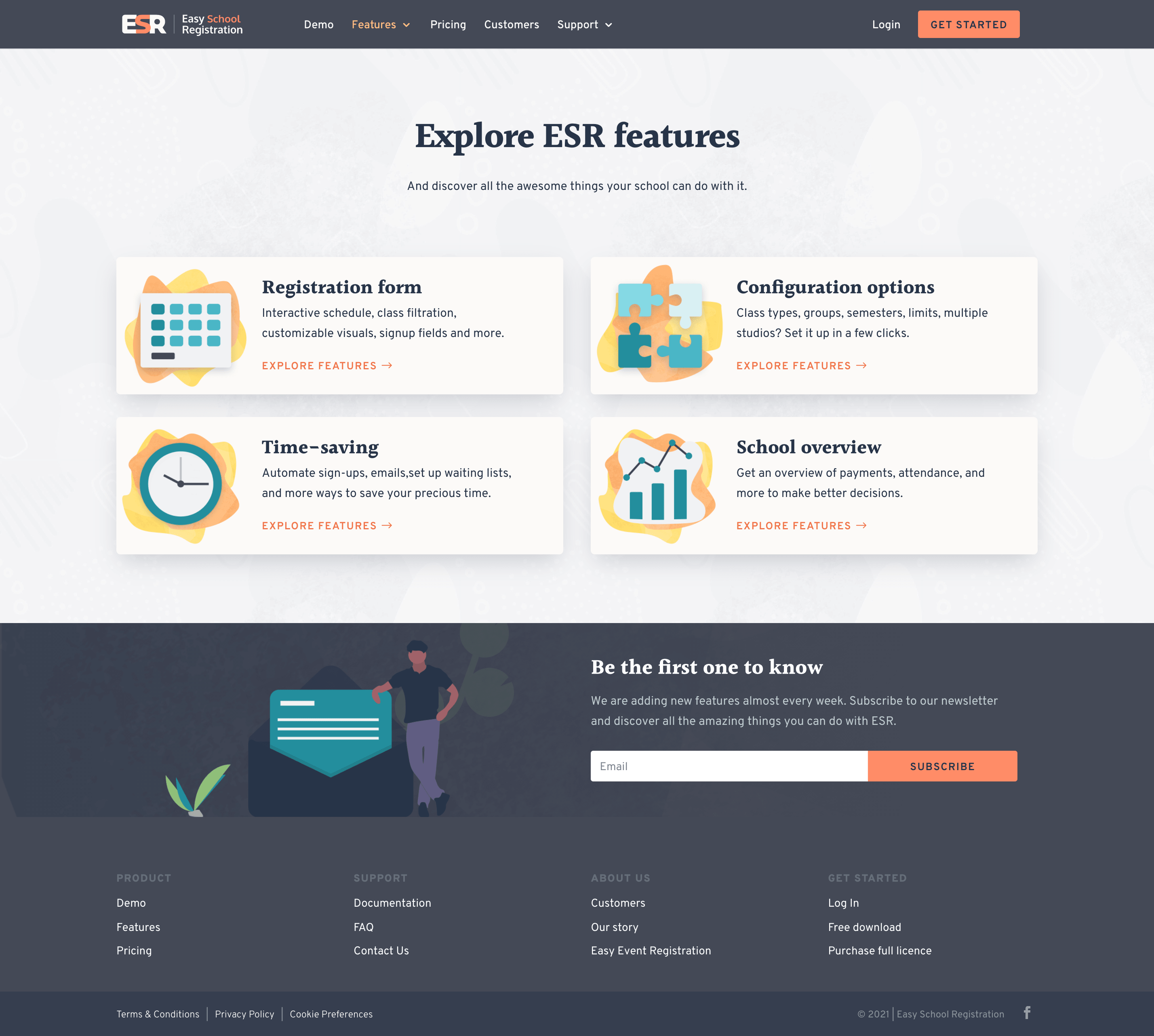
Since there were more than 40 detailed features, we decided to sort them into four categories for better discoverability.
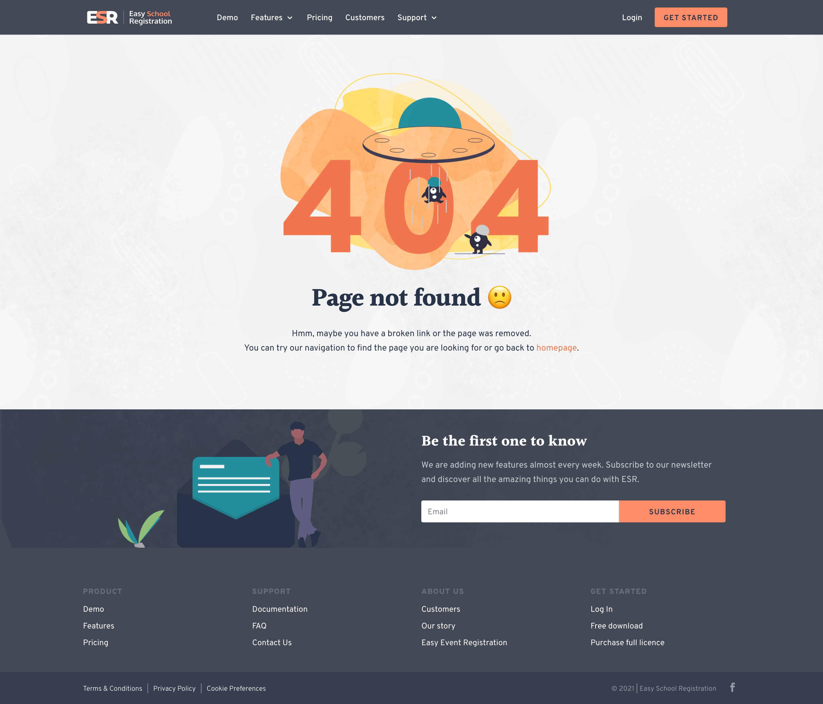
404 was not forgotten either…
Results
All the pages above were implemented. However, the client was forced to put this project on hold before I was able to finish the whole website. This was due to business damage caused by the covid pandemic. The dance schools were among the most impacted businesses so any chance of investing in a new registration system was out of the table.
The client was very happy with what was already built and we received positive feedback from potential customers as well. However, we were not able to measure the impact on sales as the purchase part of the website didn’t go live yet. Hopefully, the project will get back on track soon.
